Sticking to a single cabinet color often makes a remodeled kitchen look flat and sterile. Pairing complementary finishes on your uppers and lowers introduces immediate visual depth to the space.
Ready to compare two tone kitchen cabinets in person? Schedule a kitchen remodeling consultation with King Remodeling.
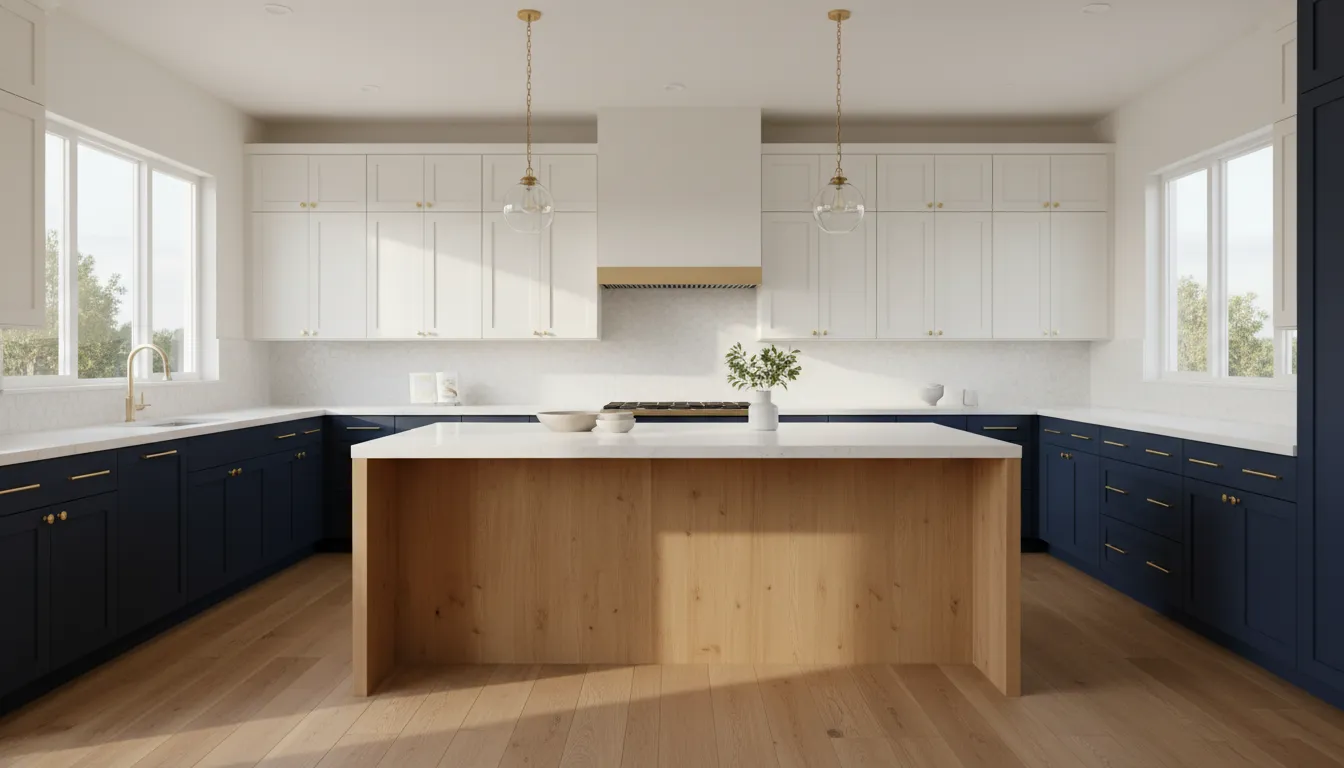
Two tone kitchen cabinets use two distinct finishes within a single kitchen layout to create visual contrast and define specific zones. This popular styling technique has remained a dominant home design trend for over five years, as reported in a trend study by HGTV. Homeowners typically apply a darker paint color or natural wood stain to their lower cabinets while keeping the upper cabinets a lighter, neutral shade. This color placement anchors the space visually, adds depth, and ensures that the upper half of the kitchen remains feeling bright and open. This guide outlines popular color pairings, details countertop and backsplash coordination, and explains how to design a cohesive and beautiful kitchen layout.
Before selecting your paint swatches or visiting our Scripps Ranch showroom, you must understand the design fundamentals of this layout style. Answering the question, what are two tone kitchen cabinets, is the first step toward a beautiful kitchen. The path begins with the basic definition.
What are two tone kitchen cabinets?
King Remodeling defines two tone kitchen cabinets as a design approach that uses two different colors or finishes within the same space. This design style has remained a popular choice for home updates since about the year 2000. By adding visual contrast, it breaks up the monotony of single-color rooms. Many homeowners use this look to make their cooking spaces feel much larger.
You do not have to settle for a single paint color during a remodel. Integrating contrasting tones allows you to express your own personal style. For example, adding a dark color to a light space highlights your main cooking area. Research from Morningside University shows that dual tones are an excellent way to inject your own creativity into a kitchen.
Defining the two-tone look
Using custom kitchen cabinets helps you split your colors in several ways. The most common layout uses a dark color on lower cabinets and a light color on upper cabinets. This approach keeps the room from feeling heavy by drawing the eye upward. You can also pair a stained wood finish with a painted surface to highlight natural wood grains.
How color splits work in kitchen remodeling
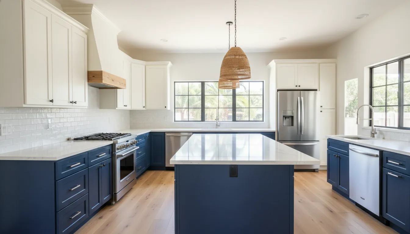
Another popular option is using a contrasting color on your kitchen island to create a strong focal point. Designers often use a neutral tone on the outer walls and a bold color on the island. For instance, a deep blue or a rich green makes the island stand out. This method works well in open-concept homes.
When choosing your colors, you should think about how they affect the room. Light colors like white or greige create a sense of comfort and luxury, while darker tones add visual weight. According to studies on color trends, modern schemes can impact your emotional well-being. Using deep, earthy green tones on lower cabinets can help create a peaceful and cozy space.
Designing for San Diego homes
For San Diego homeowners, choosing the right combination requires hands-on planning. Coastline homes often benefit from bright, sandy neutrals paired with soft ocean blues. To help you coordinate, you can visit our Scripps Ranch showroom to view your cabinet samples alongside quartz or granite countertops. Getting professional help ensures that your final kitchen cabinet replacement looks beautiful and lasts for years.
Kitchen cabinet color combinations that work
King Remodeling recommends that the best two tone kitchen cabinets do more than look stylish. They solve a design problem: how to add contrast without making the room feel busy, dark, or disconnected from the rest of the home. A helpful starting point is the 60-30-10 rule: let one cabinet finish carry most of the kitchen. Use the second finish as a supporting color, then reserve hardware, lighting, tile, or decor for the final accent. In many San Diego kitchens, that means keeping uppers light, using a deeper color or wood tone below. And testing every sample next to the countertop and backsplash before finalizing the plan.
Quick comparison of popular two-tone cabinet pairings
| Combination | Best for | Watch out for |
|---|---|---|
| White and navy | Medium to large kitchens. Coastal style. White quartz. Brass or brushed nickel hardware. | Navy can look heavy in low light. Use it on lowers or the island. |
| Gray and wood | Modern, transitional, and organic kitchens. Best when you need warmth without strong color. | Cool gray can feel flat. Balance it with warm wood grain and layered lighting. |
| Black and white | High-contrast modern kitchens. Slab doors. Statement islands. Clean lines. | Black shows dust and fingerprints. It can also show water marks. |
| Sage and cream | Smaller kitchens. Cottage-inspired spaces. Warm stone counters. Relaxed family homes. | Choose muted sage, not bright green. It will age better. |
| Taupe and walnut | Warm minimalist kitchens. Natural stone. Mixed metals. Open floor plans. | Undertones matter. Compare taupe samples against floors and wall color. |
| White and natural wood | Small kitchens. Scandinavian style. Coastal spaces. Bright, airy rooms. | Natural wood needs durable finish near sinks, dishwashers, and cooking zones. |
Choose colors based on size and light
Kitchen size should guide where each color goes. In a compact kitchen, lighter upper cabinets help the walls feel taller and more open, while a wood or muted color on the base cabinets grounds the room. If the kitchen is wide, has a large island, or opens into a dining area. You have more freedom to use navy, black, walnut, or a saturated green as a focal point. A dark island with lighter perimeter cabinets is often the safest way to add drama without shrinking the whole space visually.
Lighting can change everything. A gray that looks soft in a showroom may read blue under cool LED bulbs, while cream can turn yellow beside certain quartz slabs. Before ordering cabinets, view painted and stained samples in the actual kitchen during morning, afternoon, and evening light. King Remodeling’s showroom and design process are especially useful here because cabinet samples, countertop options, and backsplash materials can be evaluated together instead of chosen in isolation.
Match the style to daily maintenance
Style matters, but maintenance decides whether homeowners still like the kitchen two years later. White and cream are bright and resale-friendly, yet they can show splashes around coffee stations, trash pullouts, and range areas. Black and navy hide some stains but reveal dust, fingerprints, and hard-water spots. Natural wood and walnut add depth because the grain brings movement to the room, but they need a finish that can handle cooking humidity and regular cleaning.
For most households, the most practical two tone kitchen cabinets use the busier or darker finish where hands touch most often: base cabinets, the island, and pantry zones. Then the lighter finish stays up high where it reflects light and keeps the room calm. This balance works across coastal, modern, transitional, and warm minimalist kitchens. And it gives the design enough contrast to feel custom without locking the homeowner into a short-lived trend.
Should upper or lower cabinets be darker?
If you are planning a kitchen cabinet replacement, you must decide how to distribute your colors. Using contrasting dual tones is an excellent way to inject your personality into the space. This design style uses two different colors or finishes to create visual depth. Selecting the right combination of light and dark shades will define the look of your entire home.
The classic color layout
The traditional approach places lighter colors on top and darker colors below. This grounds the room. It also makes your ceiling feel higher. Darker base cabinets easily hide dirt, scuff marks, and dust from daily foot traffic. Meanwhile, light upper cabinets reflect natural light to keep the cooking area bright and airy. This arrangement works well when designing custom kitchen cabinets. For a balanced feel, designers often apply the sixty-thirty-ten color rule. You can use neutral colors like white or greige to create a sense of comfort and luxury.
When to reverse the layout
Sometimes, placing darker colors on top makes sense. This reversed style works best in large rooms with tall ceilings. Dark upper cabinets bring the ceiling down visually to create a cozy feel. But you must study the light. According to design experts, lighting impacts color perception because the same gray paint can look different under varying light levels. If your kitchen has massive windows, dark uppers will not feel heavy. For smaller spaces, a reversed layout can feel cramped. You should check out some small kitchen cabinet design ideas to keep the room open.
Selecting kitchen island colors
Using a different color for your kitchen island is another great way to style two tone kitchen cabinets. The island can act as a beautiful accent. This design helps you visually separate different areas of your kitchen. For example, you can paint your perimeter cabinets white and choose a deep blue for your island. Psychology studies show that humans prefer colors associated with clear skies and clean water. This royal color creates a calm, regal feel. You can also use warm undertone neutrals to build a cozy, comfortable cooking space that feels inviting.
Coordinating flooring and room size
To make your space look balanced, you must coordinate your cabinets with your flooring. If you have dark wood or tile floors, lighter lower cabinets can keep the room bright. For small kitchens, using light colors on all your cabinets is usually best. This design helps make a tight room feel much larger. When selecting materials, we recommend visiting a design center. According to local remodeling experts, showroom visits are essential because they let you coordinate cabinet colors with granite or quartz countertops.
How to coordinate cabinets with countertops and backsplash
Two tone kitchen cabinets work best when the rest of the room supports the palette. The goal is not to make every surface the same color. It is to create a clear relationship between cabinets, countertops, backsplash, flooring, hardware, wall color, and undertones so the kitchen feels planned, balanced, and easy to live with.
Use the countertop as the bridge
Start with the cabinet color that covers the most visual area, usually the perimeter cabinets. Then choose the second tone for the island, lower cabinets, or a feature wall. Once those two colors are set, use the countertop as the bridge between them. A white upper cabinet and walnut island can feel cohesive when the countertop includes warm beige, taupe, or subtle brown veining. Navy or deep green lower cabinets often pair well with white quartz, soft gray stone. Or a warm neutral slab that keeps the darker color from feeling too heavy.
The countertop should also match the level of contrast you want. If the cabinets already have strong contrast, choose a calmer countertop with simple movement. If both cabinet colors are quiet, such as warm white and light oak, the countertop can add more character through veining or texture. King Remodeling’s design-build process and Scripps Ranch showroom help San Diego homeowners compare cabinet and quartz or granite countertop samples together before final selections are made.
Let the backsplash, flooring, and wall color support the palette
The backsplash should connect the cabinet and countertop pairing rather than compete with it. If the countertop has dramatic veining, use a simple backsplash in a related white, cream, greige, or soft gray. If the countertop is solid or understated, the backsplash can add controlled texture through handmade-look tile, a stacked pattern, or a subtle mosaic. Avoid adding another strong color unless the cabinet combination is already simple.
Flooring is just as important because it sits beside the cabinets across the full room. Warm wood-look flooring can soften white, blue, green, and gray cabinets, while cool gray flooring can make warm cabinet finishes look slightly off. In open-plan homes, the kitchen floor also connects to nearby living areas, so the cabinet palette should make sense with furniture, trim, and existing finishes. Wall color should be tested beside the upper cabinets and backsplash because even a small shift from warm white to cool white can change how two tone kitchen cabinets read in natural and evening light.
Check undertones before approving materials
Undertones are the hidden color cast in each finish. Whites can lean creamy, gray, yellow, or blue. Wood can lean red, golden, brown, or neutral. Metals can feel warm, cool, or mixed. Before committing, view every sample together under the actual lighting planned for the kitchen.
- Choose the main cabinet color that will cover the largest area.
- Select the secondary cabinet tone for the island, lowers, uppers, or feature section.
- Pick a countertop that connects both cabinet colors through background color, veining, or warmth.
- Choose a backsplash that either blends quietly or adds texture without fighting the countertop.
- Confirm flooring, hardware, and wall color together so all warm, cool, and neutral undertones align.
Hardware should be the finishing layer. Brass and champagne bronze add warmth to blue, green, white, or wood cabinets. Matte black sharpens modern palettes. Brushed nickel and stainless finishes often suit cooler schemes. When every sample is reviewed together, the final kitchen feels intentional instead of pieced together.
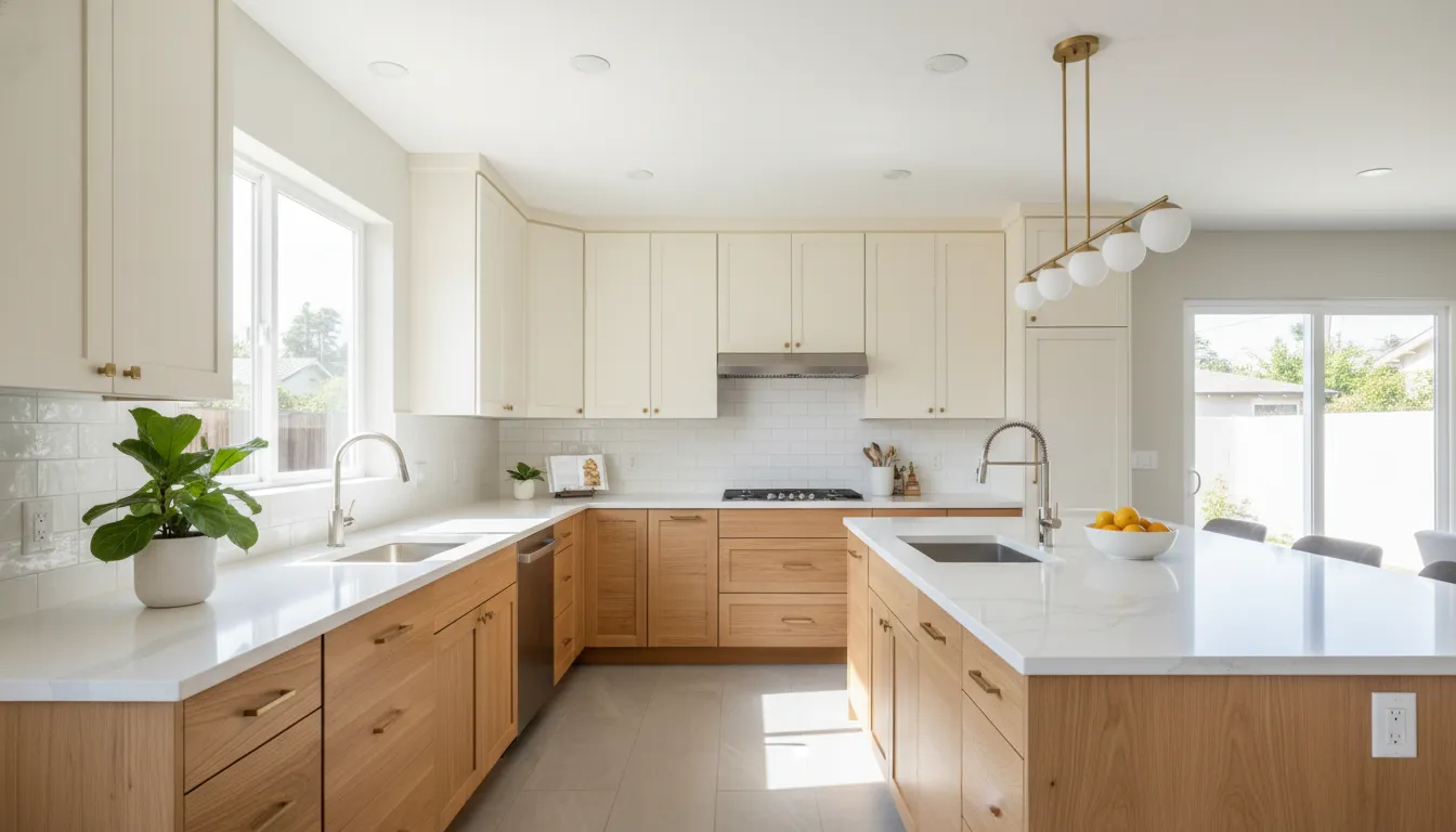
If your color palette is narrowing down, visit King Remodeling’s Scripps Ranch showroom to compare cabinet samples against countertop slabs, backsplash tile, flooring, and lighting before construction begins.
Common mistakes with two color kitchen cabinets
King Remodeling sees two color kitchen cabinets make kitchens feel custom, layered, and more intentional when the whole room is planned together. The biggest mistakes usually happen when cabinet colors are chosen in isolation, without checking countertops, backsplash tile, flooring, hardware, and natural light. Before committing to two tone kitchen cabinets, treat the palette like a complete design system, not two separate paint choices.
Using too many finishes at once
A two-tone cabinet plan already gives the kitchen contrast. Adding several wood stains, multiple metal finishes, patterned tile, bold counters, and a strong wall color can make the space feel busy instead of balanced. A practical fix is to choose one dominant cabinet color, one secondary cabinet color, and one accent finish. The 60-30-10 approach is a helpful guide: let the main cabinet or wall color carry most of the room. Use the second cabinet color for contrast, and keep hardware, lighting, or decor as the smaller accent.
This is especially important when mixing painted cabinets with natural wood. Wood grain adds movement, so it often pairs best with a quieter painted shade, such as white, cream, greige, navy, or soft green. If the island is the accent, keep the perimeter simpler. If the lower cabinets are darker, keep the uppers lighter so the room still feels open.
Ignoring undertones, lighting, and room size
Colors that look compatible online can clash in a real kitchen. A cool white can make a warm wood look orange. A warm cream can make a cool gray look flat or slightly blue. The fix is to compare undertones side by side with the actual counter, backsplash, flooring, and hardware. Do not choose cabinet colors from a screen alone.
Light also changes everything. A shade that looks soft in a bright showroom can look much darker in a north-facing or shaded San Diego kitchen. Test large samples vertically on the cabinet area and view them in morning, afternoon, and evening light. If the kitchen is small or has limited natural light, avoid putting a heavy dark color across all uppers and lowers. Use the darker tone on the island or base cabinets, then balance it with light upper cabinets, reflective tile, or a brighter countertop.
Choosing trendy colors without testing samples
Deep blue, earthy green, black, and warm neutrals can all look beautiful, but an overly trendy shade may feel dated faster than a classic palette. Instead of chasing the boldest color, choose a tone you can live with daily and that fits the home. If resale is a concern, keep the permanent elements more timeless and use trend-forward color in places that are easier to update.
The best safeguard is sampling. Bring cabinet, countertop, backsplash, flooring, and hardware samples together before signing off on the final design. King Remodeling’s San Diego showroom and design process make this step easier because homeowners can compare materials in person, not just on a mood board. For more guidance on planning cabinets that fit your layout, see our custom kitchen cabinets guide or explore small kitchen cabinet design ideas before finalizing your two-color plan.
Are two-tone cabinets a good idea for your kitchen?
Two tone kitchen cabinets can be a very good idea when the colors are chosen with the room’s size, lighting, layout, and resale goals in mind. The look has stayed popular for years because it solves a real design problem: many kitchens need more visual interest than one cabinet color can provide. But they still need to feel clean, balanced, and easy to live with. A lighter upper cabinet with a deeper lower cabinet, or a neutral perimeter with a contrasting island, can add depth without making the kitchen feel busy.
The key is restraint. A successful two-tone plan should feel intentional, not random. The cabinet colors need to coordinate with the countertop, backsplash, flooring, hardware, and wall color. That is why seeing samples together matters. At King Remodeling’s San Diego showroom, homeowners can compare cabinet finishes with quartz, granite, tile, and flooring before committing to a final palette.
How two-tone cabinets work in small kitchens
In a small kitchen, two-tone cabinets work best when the lighter color stays above eye level. White, cream, warm beige, soft greige, or a light natural wood on the upper cabinets can keep the room feeling open. A deeper lower cabinet color, such as navy, charcoal, walnut, or muted green, can ground the space and hide everyday wear better than a light base cabinet.
The mistake to avoid is using too much contrast in a tight room. Dark upper cabinets can make the ceiling feel lower, especially if the kitchen has limited natural light. If you love a darker shade but have a compact layout, use it on the base cabinets. A pantry wall, or the island instead of wrapping the room in a heavy color.
Why open-concept kitchens benefit from contrast
Open-concept kitchens often need subtle definition because the kitchen, dining area, and living space are visible at the same time. Two-tone cabinetry can help separate zones without adding walls. For example, a white or warm neutral perimeter can blend into the larger room, while a stained wood or deep blue island creates a clear gathering point.
This approach is especially effective when the island faces the living area. The island becomes a furniture-like feature instead of just another run of cabinets. It can connect to nearby wood floors, dining furniture, or built-ins while the perimeter cabinets stay bright and practical.
Best choices for resale and bold color
If resale is part of your decision, stay close to neutral pairings. White and natural wood, greige and walnut, cream and warm taupe, or light gray and navy are easier for future buyers to understand than highly personalized color combinations. Neutral does not have to mean boring. Warm undertones, natural grain, and quality hardware can make a simple palette feel custom and current.
For homeowners who want a bold color, the island is usually the safest place to use it. A bold island in emerald, navy, black, or deep olive can add personality while keeping the perimeter cabinets timeless. If tastes change later, repainting or refacing an island is simpler than changing every cabinet in the kitchen. That balance makes two-tone cabinets a smart design choice: they give your kitchen character while protecting long-term flexibility.
Want cabinet colors that look good in your actual kitchen, not just on a screen? Contact King Remodeling to review samples, layout options, and remodel priorities with a San Diego design-build team.
Want a design-build team to turn the palette into a finished plan? Contact King Remodeling for a San Diego kitchen remodeling consultation before choosing your final two color kitchen cabinets.
Frequently asked questions
Are two-tone kitchen cabinets a good idea?
Yes. Two tone kitchen cabinets are a good idea when the palette supports the room instead of competing with it. They add depth, define zones like an island and perimeter, and keep a remodel from feeling flat. The look also has staying power, with sources noting years of continued popularity. For best results, balance contrast with countertops, flooring, backsplash, and natural light.
What colors go best together for kitchen cabinets?
The best cabinet color pairs usually combine one grounded neutral with one richer accent. Popular choices include warm white with natural wood, soft greige with sage green, cream with deep blue, or white uppers with charcoal lowers. Use the 60-30-10 rule as a guide: let one color dominate, use the second for structure, and reserve small accents for hardware, tile, or decor.
Should upper or lower cabinets be darker?
In most kitchens, lower cabinets should be darker and upper cabinets should be lighter. Darker bases create visual weight, hide everyday wear more easily, and make the room feel anchored. Lighter uppers help keep the sightline open and prevent the kitchen from feeling top heavy. An island can also carry the darker tone if you want contrast without darkening the entire perimeter.
Do two-tone cabinets work in small kitchens?
Yes, two tone cabinets can work well in small kitchens if the contrast is controlled. Keep upper cabinets light, choose one calm secondary color, and avoid splitting the room into too many blocks. A darker island, base cabinet run, or wood accent can add dimension without shrinking the space. Good lighting matters because cabinet colors can look different depending on how much light reaches them.
Ready to plan your kitchen remodel?
Two tone kitchen cabinets work best when they are planned as part of the full remodel, not chosen in isolation. The right cabinet colors should coordinate with your countertops, backsplash, flooring, lighting, layout, and storage goals so the finished kitchen feels balanced and practical for daily use. King Remodeling helps San Diego homeowners make those decisions with a clear design-build process, showroom material selection, and a fixed-bid plan after the design is finalized. If you are comparing cabinet finishes, rethinking your layout, or preparing for a complete kitchen update. The next step is to talk through your goals with a remodeling team that can connect the design details to the construction plan. Request a kitchen remodeling consultation.